Monday, September 13, 2010

Introduction: The Office

WARNING:  Our office is messy...


Yes, yes.  This our office (otherwise known as the third bedroom).  I do have a plan for this room but, it seems to always take second (or third, or fourth) place in priority compared to the other rooms in the house.  Maybe this is because we always in it on the computer or because it is just so random! 

The worst part about the office is the organization.  As you can see here.  YES.  This is MY desk.  And it is definitely an example of who I am.  Artistic, full of information and, completely random.  I keep telling myself to make it to the Container Store so I can find ways to make this look a heck of a lot better.

But, like I said, I DO have a plan.  I just haven't really started implementing it.   My idea is to do the whole office in architecture and culture (which would be because my husband is an architect and I have a minor in anthropology just for the fun of it).  I sort of, kind of started....

The top picture is one of my husband's models from architecture school.  I actually saw him build this and display it at the end of the year student work show at IIT.  So I guess it is pretty cool we kept it.  It is my favorite model of his.  The bottom picture is a ceramic house he made in high school (which inspired him to become and architect) and the postcards in the frames are some 1920s cards I picked up a an antique store.  One is the Wrigley building and the other is the Watertower.  I love to collect Chicago architecture pieces like this. 

Tuesday, August 31, 2010

Painting Bears...

I used to paint a lot as a kid but, lost touch with it as a teenager due to lack of time.  Recently, I go the urge to paint something and I decided to share.

painting

I actually ended up giving him to my parents for their wedding anniversary.  Their house is all Native American art so, it will fit right in.  I always seem to end up painting Native American inspired animals in acrylics.  I think it is because we spent a lot of time traveling when I was a child to various parts of the western US and that is just what we were drawn to.  I plan to start a loon next and then another bear for my own house in our decor colors.

Sunday, August 15, 2010

Introduction: The Entryway

So we have a really small and dark entryway in our house.  It is generally only enough room for a small bench (which I lack so, you aren't going to see it!).  But I have managed to do something with the wall space.  Luckily, we have amazing photos from both our engagement session and from our wedding so, a photo collage is a need.


In my opinion, photo collages are the best and cheapest way to fill a large wall space.  It is the best because it is pictures of your family and it rarely has to be perfect (just level).  Thanks to my local Hobby Lobby (aka, the best place ever), I picked up all of these frames for under $50.  If you hit the store on the right week, all of their frames are 50% off which makes this decorating idea a no-brainer.  I chose black frames of all different shapes and sizes to go with the art on the adjacent wall.


I made this piece a few years ago using an old frame my best friend gave me because she didn't like the style and a $4.99 Sunprint kit from Urban Outfitters.  It happened to be on the clearance table and I thought it seemed interesting.  I used a few leaves and flowers (ok weeds) that were growing under the porch of our apartment to create the prints and then simply framed them.

Sunprint kits are actually really fun to use and I have used them before for making cards and in scrapbooks. I believe you can get them in all different colors (although blue seems to be the most common) and they work by being bleached in direct sunlight.  When an object is placed on them to block the sun or even partially block the sun, they create a sort of 3D image on the paper.


Saturday, August 7, 2010

Introduction: The Dining Room


When my husband and I were looking for a house, I had one specific request: A formal dining area.  Although this concept seems like a pretty common one, sadly, finding a house that isn't super old or super new in the Chicagoland area within a good price range WITH a formal dining room is a daunting task.  Somewhere in the mid-eighties to mid-nineties, families in this area ceased to want to a formal dining room.  I am not sure why this concept because unfashionable in this time period but, we had a really hard time finding a house with one.  Most houses had either never been planned with one in them by the developers or the dining room was somehow deleted and another room (such as the kitchen) was expanded into the space.  However, for me, a dining room is an important space.  I grew up with one and I grew up with formal Sunday dinners with family so, for me, this was important. 


The decor of our dining room is generally based around the furniture.  We got this whole dining set from a furniture store called Dania who specialize in Danish furniture.  I have had furniture from Dania my whole life.  My parents house and my in-laws house have furniture from here and it has proven in both cases to be timelessly fashionable and extremely durable (especially in the case of my in-laws with 4 kids and two big dogs).  So naturally, we had them as our first choice for furniture (our couches and coffee table in The Living Room are from Dania as well). 

The furniture to me sort of screams Frank Lloyd Wright-esque.  The runner on my table is actually one of his designs and from the Frank Lloyd Wright Foundation.  My mother got it for us for Christmas last year. 


The glass rooster was my grandmother's.  We are not quite sure where he came from but, we know he originally had a brother that fell and broke.  I have a faint memory of my grandmother telling me that he was from France (she was born and raised in Paris and was a war bride) but, the origin is essentially lost.  He is one of my favorite pieces in my house.


I also insisted on having a china cabinet in the dining room.  This was another adventure that was deemed trying.  Apparently, people are not requesting china cabinets anymore and this was was actually one of the last ones Dania was selling and it was on clearance with a small scratch on the side (which you can barely notice) so, we took it.  I actually love the idea of china cabinets and I am not sure why they are out of style.  Where else do you put fragile and precious things?  Ours contains some of the Lladros my mother-in-law gave us, a Morroccan port wine set that was my grandmother's, a beautiful Kate Spade rose vase my best friend and Maid of Honor got us for our wedding, my nativity set, my bridal bouquet, and our crystal wine glasses.  I mean, where else would such stuff go other than a china cabinet?  (ok, I digress).


This is the sideboard.  I keep all my linens and our alcohol in it.  On top is our wedding photo and a vase we bought off a street vendor in Costa Rica.


Finally, this is a Tuscan scene decorative plate we got from a family friend (the ones that gave us the couch in our Front Room).  I love this plate and finally got around to hanging it.  Which was hard because it is big and heavy!

Saturday, July 31, 2010

My New Couch....

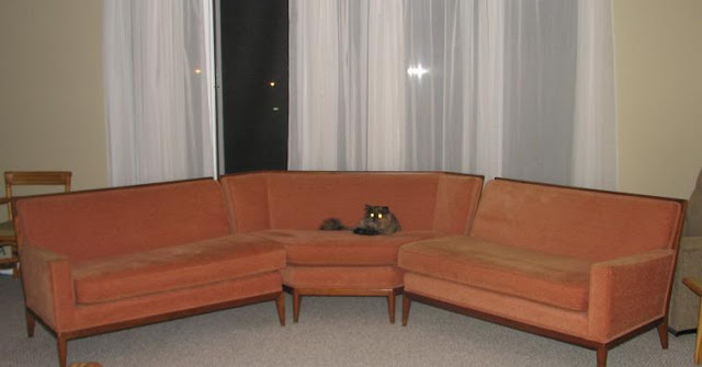
So, I randomly scored a new (vintage) couch from a family friend this week.  They were redoing their front room and mentioned that they would try to sell the couch on Craigslist.  I jumped the opportunity and offered to buy it from them.  Luckily, they were more than generous and gave us the couch for nothing!


So here it is!  (Ignore my cat).  Its a vintage 1960s sectional with peach upholstery.  Not exactly my first choice for color on the fabric but, I am beginning to like it.  It reminds me of the show Mad Men.  Something Don would have in his office or at least something in a swanky hotel Don would seduce a woman in.  My cat has taken a special loving to it.  I think she believes it is for her because she never leaves it unless we are feeding her.

I am not sure the decor of this room yet.  The picture is taken in our front room.  It is the least decorated room and the previous owner used it for a pool table (he was obviously a bachelor).  Eventually, a white baby grand piano will go in this room (my husband inherits one from his parents but we want to put in wood floors first).  So, I am thinking it should be a bit jazzy.  I sang jazz for years and it is my music of choice so it would be nice to have a room that is slightly dedicated to my musical passion.  I am not so sure the husband will agree but, then again, he liked the pool table idea the previous owner had (hah.  men.).

Monday, July 26, 2010

Introduction: The Living Room


This is our most lived-in space.  Mainly because this is where the TV is and because it is the closest to the kitchen.  We received these couches from my in-laws when we moved into the house as a housewarming gift.  I really like them even though they are not really my style (they are my husbands style).  I think the biggest issue in this room is the color of the walls.  I really love grey walls but, I think it is a bit too dark next to the couches.


Whenever someone asks me what the theme of this room is, I say, "dark nature."  Although, I am not sure that that statement really means anything to any one but, well, me.  I see it as dark colors with pops of greens and sages in silhouettes of various natural things.  I really want to have some crazy black and white photos ala Ansel Adams but, haven't gotten around to purchasing any. 


I feel that the style sort of shows through in some of the pieces that currently exist in the room but, I am well aware it lacks some ooomph.


Wednesday, July 21, 2010

Introduction: The Upstairs Bathroom


This is our upstairs bathroom.  It is probably one of the only styled rooms in the house.  I based the entire color scheme and decor off a Roger & Gallet soap box (as seen below...we use it to store scissors, tweezers, etc).  The reason this little box is so important is that it is the brand of soap I bought him when I visited him during his semester abroad in Paris for Architecture school.  Well, and it is pretty.


Another unique piece in the bathroom is a set of decorative wall plates that were my grandmothers.  They are from the French Mediterranean coast and I inherited them when she passed away.  You can't tell, but they are sort of 3D.


We also have what my husband calls as useless towels set up in a cheapy IKEA bookshelf.  We have had this bookshelf forever.  It once sat in my closet as a way to store sweaters in our old apartment in Chicago.  It doesn't store much but I would love to replace it.